Creative Buzz

Just another WordPress.com site

Category Archives: Design

Brilliant news SampleBoard.com has been rebranded for optimal user experience

Yes www.sampleboard.com has been made even better. The wonderful thing about the sampleboard team is the desire to be on the lookout for ways of enhancing and improving an already excellent web site.

SampleBoard’s entire site has been improved and rebranded  

Towards the end of 2011 SampleBoard.com a design-focused website was selected as one of four start-ups in the first ever Google Umbono programme, consisting of seed funding and mentorship for online entrepreneurs.

Google believes in SampleBoard.com     

For those of you who are new to SamplBoard.com; SampleBoard offers an online image editor for creative professionals to quickly and easily put together inspiring designs and professional visual concepts. All designers know the conceptualizing of visual design ideas is vital. Creating sample boards in the traditional manner is very time consuming and costly.

Creating design concepts boards just got a whole lot easier, faster, and greener

SampleBoard.com developed by designers for designers has created a brilliant eco friendly online way of digitally creating sample boards. There is an extensive library of images, designers can easily upload their own images and the boards can be emailed directly to clients. Adjustments and changes to the concept boards can be made in minutes saving time and energy.

SampleBoard.com is an easy way to impress clients with your design flair and eco credentials  

In a nutshell SampleBoard.com is a trendy up to date way of presenting design ideas. Presenting your design ideas just got a whole lot simpler, faster, better and greener with this professional rebranded web site. I believe we cannot under estimate the power of a great presentation. Presentations give us the opportunity to sell our design ideas and show our design flair. Everything we do, from how we dress to how we design sample boards in a folio has an impact on how we are perceived by a client.


Great presentation boards sell design ideas

The best way to understand and enjoy the improvements to SampleBoard.com is to visit the new enhanced digital concept board editor and have a go. Please be aware there may be some adjustments that need to be made, bear with us and give us lots of feedback so we can give you the user an optimum conceptualizing experience.

Have a look at the images here to glimpse the improvements

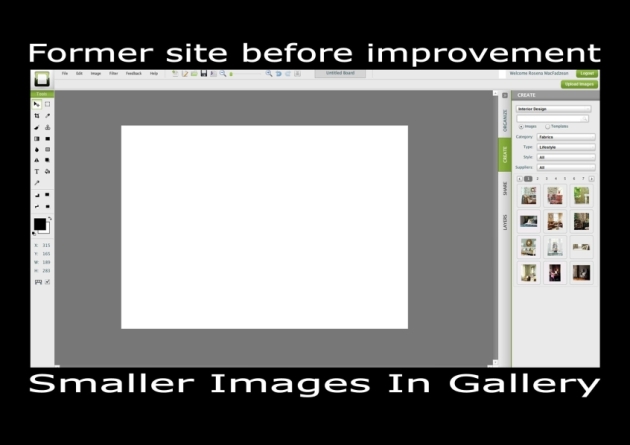
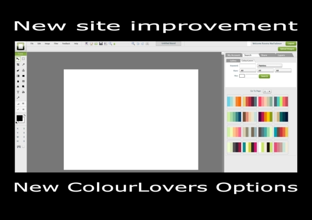
I have placed some examples of the improvements made by the SampleBoard team in this blog. For example note the difference in the size of the images in the gallery making it easier for the designer to make selections. The new SampleBoard site has made it easier to share and export concept boards to for example the community or via twitter. There is also a new colour scheme option available for ColourLovers. The site is easier to navigate, cleaner and sharper. I’m the type of person who usually hates changes to any technology I work with. When Google, twitter or wordpress make changes I often shout “OH No! Why did they do that? Are they trying to confuse me” So for me to say it’s easier I do mean it? We really look forward to and welcome your feedback.

Happy Conceptualizing and Creating    

The impact of the economic crises on interior design

This is an interesting topic I have been wondering what the real impact on design is. I read an article in the New York Times (April 3 2011) called Design well within reach. The article discussed how the disaster of the Great Depression in the 1920s impacted on interior design at the time. There was a move toward modernism; design became functional for example Alvar Aalto chairs.

Interior design trend called undecorate

During this current recession the article explains a trend has developed in interior design toward eclectic do it yourself design. A term called ‘undecorate’ has been used by Christiane Lemieux to describe the movement. A phrase ‘democratization of design’ has been in use for some time and has now maybe come to be an eventuality. People have become very resourceful at finding discounted items via the internet.

People finding discounted interior decorating items via internet

It appears as if the amateurs are leading the way and designers have been left behind. I know in Australia the level of design literate amateurs has increased amazingly over the last few years. You only have to look at the design shows on TV (some very good ones) to be aware of this. However design rules are being broken; principles like harmony and balance have become passé. Fabrics are mismatched and wallpaper placed on ceilings and over moldings. An attitude of anything goes is current.

Interior design rules are broken

Maxwell Gillingham from the Apartment Therapy blog is quoted as saying ”There’s no longer any good or bad… that new openness is the story. We’re all swirling around together.” There has been a move toward individual expression instead of professional polish.

Sample Board ‘Inspired by Modernism’ created by Rosena on sampleboard.com

No good or bad interior design

The article discusses a photographer called Todd Selby. He has created a website where he shows a range of rooms from the homes of creative people like musicians and writers. The rooms indicate the undecorate trend has been followed. Images show wallpaper peeling, lots of clutter and items such as thrift shop paintings. That is not to say you can’t find some great second hand items.

Individual expression in interior design is all important

The question is where does that leave us? I have always thought good design should not be available to only those who can afford it and for this reason I have held workshops and taught TAFE Interior Decorating classes for those interested in DIY decorating. But I must confess I do find it difficult to look at messy rooms with no harmony, balance or correct proportion. I suppose the same thing is happening with cooking to some extent Chef’s must look at amateur cooking shows and shudder as I do. That is not to say some beautiful dishes and rooms are not offered up by the non professionals. What do you think? Where do you think the interior design profession is or is heading in these hard economic times?

Google gives SampleBoard a nod of approval

It has been an exciting and busy week for SampleBoard. I am so pleased to be part of the sample board team. I have had the pleasure of working with Ros since 2009 as the Australian agent for SampleBoard. Below is the press release. I have added the links from the media release below. Following the document you will find some examples of boards created on the SampleBoard site

Click here to find out what designers are saying about SampleBoard… http://www.sampleboard.com/aboutus

Sign-up and experience SampleBoard for yourself, help power the world’s creativity http://www.sampleboard.com/register

Now for some examples of interior design, wedding planning, landscape and fashion mood boards from the SampleBoard Creative Community

Mood board created by Pixy Louise Smith on SampleBoard.com

Sample Board created by Bogna Sarosiek on SampleBoard.com

Mood board created by Rosena on SampleBoard.com

Mood board created by Mane Carrion on SampleBoard.com

We extend an invitation to you to become part of the SampleBoard’s Creative Community be inspired and inspire others and help power the world’s creativity. We look forward to exciting days ahead.

Some tips from a Master of Interior Design

As I drifted off to sleep a few nights ago I was thinking about design not unusual for me but in particular about New York Style.  Would you believe it the next morning I read in House Beautiful (September 2011) the start of a new column called Master Class. In the first Master Class column the colorist and designer Alessandra Branca was interviewed.

Alessandra Branca Interior via Consider Yourself at Home blogspot

Alessandra makes a number of recommendations. She suggests investing in a few classic pieces that will stand the passage of time. An example of this is the Louis chair she has in her apartment (see image below). Branca states a sofa with clean lines and in a neutral fabric can be (like clothing) dressed up or down. She dislikes sofas with huge arms as they take up too much space.

Alessandra Branca’s use of Louis chair via Home Beautiful

When designing she thinks it is most important to have a plan, think everything through; it takes time to decorate successfully. Alessandra states it is important to see the overall picture and consider each detail.

Sample Board created by Rosena on SampleBoard.com

Tips from a Master of Design on Design

  • Have a plan
  • Take time
  • Think everything through
  • Consider each detail
  • See the overall picture
  • Invest in classic pieces
  • Select sofas in neutral fabrics with clean lines and small arms
  • Oh and remember the corners of rooms

Branca describes her New York apartment as a mix of English country comfort, old world Italian elegance, and French sensuality with a relaxed American sensibility and a punch of red. The corners of her apartment are decorated with a botanical grid painted by her artist mother. Alessandra believes corners are under considered in room design.

Sample Board created by Rosena on SampleBoard.com

I have created some mood boards inspired by Alessandra’s electric mix of styles and use of red. It is great to have the opportunity to have a glimpse into the mind of a master designer like Alessandra.

Why not follow the Hollywood Interior Design trend for Chinese Blue and White

One of Tina Charles’ tweets this week was ‘Hot in Hollywood – Interior designers just love Chinese Blue and White accents’.  The link from the tweet leads to a wonderful array of Chinese blue and white porcelain. This tweet got me thinking.

Sample Board created by Rosena on sampleboard.com

The Chinese started to create porcelain during the Tang dynasty 618 AD – 906 AD. During the 14th Century in the Ming dynasty China was the most important centre for porcelain in the world. The blue used in the blue and white porcelain came to China from Persia in 1290 AD. It wasn’t until the 17th century many Europeans became aware of these beautiful objects.

England and other nations bought and then copied the blue and white style of porcelain and Chinoserie was very much in vogue. It has been in and out of fashion ever since. I thought I would join the Chinese Blue and White party and have created some sample boards to illustrate how these items in this instance lamp bases can be used.

Sample Board created by Rosena on sampleboard.com

The wonderful Thibaut Design fabrics and wallpapers work well with an 1860 Chinese lamp. The lamps used in the boards are available from the Antique and Vintage Lamp Shop. The other boards indicate how the antique lamps can be used in contemporary schemes. In the orange scheme the lamp becomes a discordant object adding interest to the scheme.

I found this brilliant site which can give you a guide to Chinese Pottery and Porcelain Marks http://www.oldandsold.com/pottery/china1.shtml . You may also be interested in this article http://www.articlesbase.com/interior-design-articles/antique-lamps-blue-and-white-is-always-right-1430494.html it goes into a lot of detail.

Sample Board created by Rosena on sampleboard.com

The more I use the sample board digital editor the more I am impressed with what can be done on the site. It is a great way to hone your color and design skills. It is also a great place to be inspired by other designers. The wonderful thing is it is fun and can become addictive. So why don’t you join us and help power the world’s creativity.

Recipes for Interior Decorating Success Part 3: How to create a funky room, a sophisticated room with a with touch of traditional style and a warm elegant room

As mentioned in the Part 1 of Recipes for Interior Decorating Success a recipe is a formula. In this blog I will give the formula on how you can create a lively funky room, a sophisticated traditional room and a warm elegant room. The same basic ingredients for an all white room will again be the basis for the interior decorating recipes.

How to change a basic white room into a young lively funky room

Basic ingredients for an all white room

Timber floor boards – painted white

Skirting board, architraves – painted white

Ceiling & Walls – painted white

Sofa – white fabric

Cushions – white fabric

Sample Board created by Rosena on SampleBoard.com

As illustrated in the image above to these basic ingredients black and white art work and a red chair has been added. You can change the feel of a room not only with colors but also by selecting different styles of decorating items. In this example the room is given a lively funky look by the addition of red, blue chairs and light fitting, two fluffy black lamps and a cow hide floor rug. This immediately gives the space a fresh young fun look.

To create this young lively funky look:

Cushions – Red glossy and silver in a damask style from Fundi Designs

Table lamps – black shades with feather trim on stainless steel bases from Fundi Designs

Armchairs – blue upholstery on stainless steel base by Sean Williams

Side tables – black in a fun egg timer design from Zumod of South Africa

Floor rug – black and white cow hide from Zumod

Light fitting – red and blue chandelier design from Custom Lighting of Australia

Sample Board created by Rosena on SampleBoard.com

To create a warm elegant comfortable room

You can also create an elegant understated room by adding items of elegance in muted dusky colors. To achieve this look you need to add the following ingredients.

How to change a basic white room into a warm elegant room

Light fitting – woven pendant from Fundi Designs

Armchair (s) – White to match sofa from Wunders of South Africa

Sheer fabric – White stripe from Osborne and Little

Curtain fabric – Dusky pink linen from Osborne and Little

Coffee Table – Replica of an Eric Pfeiffer table from Zuomod

Floor Lamp – spiral timber base with lamps shade in colors to harmonize with coffee table

Floor Rug – Silk Road Weaves in ducky pink and brown from Integral Color

Sculpture – white with black base from Andre Stead Sculpture

Wallpaper – dusky pink in contemporary design from Thibaut Design

Cushion fabric— dusky pink silk from Osborn and Little

Sample Board created by Rosena on SampleBoard.com

To create sophisticated room with touch of traditional style

The basic white room can be transformed into a sophisticated formal room. You can add items of designs based on traditional styles. Adding traditional styled lamps with silk and velvet fabrics for cushions gives the room a sense of luxury a very different look from the young funky room.

How to change a basic white room into a sophisticated room with touch of traditional style 

Wallpaper – Metallic stripe reminiscent of traditional wallpapers from Osborne and Little

Lamps – in traditional style from Antique and Vintage Lamp Co of Australia

Light Fitting – Orchid Pendant adds to the glamour of the room

Side Tables – in metallic gold in traditional style from Weylandts of South Africa

Armchair – Original style based on classic styles from Weylandts of South Africa

Curtains – soft green silk from Osborne and Little

Cushions – made up from fabrics of green silk and velvet flock from Osborne and Little

Floor Rug – Gonsenhausers green and dark beige in traditional style from Carpet and Décor Rugs

This is the last blog in this series of Interior Decorating Recipes. Starting with a basic plain white room you create a background from which a series of different looks can be achieved.

The sample board website provides you with a platform where you can easily play around with your ideas. As I have done in these series of blogs. It also provides you with a detailed summary of every item you select for your boards. If you haven’t done so already I invite you to have a go by following the link all you need to do is click on the Create Your Own Digital Mood Board on the right (under Creative Buzz Links). Have fun!!!


Recipes for Interior Decorating Success Part 2: How to create a Hot Orange Room & a Cool Blue Room

As mentioned in the last blog a recipe is a formula. In this blog I will give the formula on how you can create a hot lively room or a cool tranquil blue room. The same basic ingredients for an all white room will again be the basis for the interior decorating recipes.

Board created by Rosena on SampleBoard.com

A basic white room can be changed into a lively hot or tranquil cool room

Basic ingredients for an all white room

Timber floor boards – painted white

Skirting board, architraves – painted white

Ceiling & Walls – painted white

Sofa – white fabric

Cushions – white fabric

As illustrated in the image above to these basic ingredients black & white art work has been added. If you have a room that appears cool, dark and gets little sunlight you can create an appearance of warmth by adding warm colours. In this example orange and gold has been used for the transformation. You could use any warm colour or colours in the same way.

Sample Board created by Rosena on SampleBoard.com

Hot lively orange room

To turn the all white and what can sometimes be clinical room into a room that appears warm and inviting select warm colours. In this example orange, gold, tan with touches of black and grey creates a hot lively room. To achieve this just add the following ingredients.

Ingredients

 Wallpaper – contemporary gold from Thibuat Design

Curtain Fabric – grey and charcoal stripe velvet from Osborne and Little

Floor Rug – Gonsenhausers in orange, gold and tan geometric pattern

Armchair – orange is replica design from Zuomod of South Africa

Side Tables – honey timber eco friendly from Aidan Bennetts Design of South Africa

Ottoman – tan, brown with touch of white animal skin from John Du Plessis of South Africa

Ottoman – the ottomans could be of Faux Leathers in tan and orange from Comfort Creations of South Africa

Cushions – deep orange and black from Fundi Designs of South Africa

Floor lamp – honey timber with black and grey shade from Weyers Marais

Table lamp – black weave from Fundi Designs

Pendant light – black weave from Fundi Designs

Art Work – abstract in orange, grey and charcoal by Donovan Stanford

Below is another example of a warm room

Sample Board created by Rosena on SampleBoard.com

Cool Blue Room

If you have a white room that appears hot and glary you can transform it into a room that appears tranquil and cool by adding cool colours. In this example blue has been added to the white room. Too much blue can be depressing and dull. This has been overcome by adding touches of light toned yellow and crisp white furniture. To achieve this just add following ingredients.

Sample Board created by Rosena on SampleBoard.com

Ingredients

Wallpaper  – blue in a contemporary pattern by Thiaut Design

Shutters – white from The Plantation Shutter Company

Floor rug – blue with touches of light toned yellow by Silk Road Weaves fromIntegral Color

Armchair – white leather by Zumod of South Africa

Coffee table – replica of Isamu Noquchi table in white from Zuomod of South Africa

Side tables – simple cube design in white from Zuomod of South Africa

Pendant light – white from Lights By Linea of South Africa

Floor lamp – sculpture like in white from Province Lighting of South Africa

Table lamps – simple white shades with chrome base from Lights By Linea

Art Work – abstract blue and grey by Donovan Stanford of South Africa

Fabrics for cushions – linen in toned yellow from Osborne and Little, retro pattern in toned yellow and white by Osborne and Little, damask in blue and soft grey from Osborne and Little

Below is another example of a cool blue room

Sample Board created by Rosena on SampleBoard.com

So there you have two more recipes for an all white. The options are endless.

Recipes for Interior Decorating Success: Part 1: How to Create a Black and White Room

A recipe according to the dictionary is any formula especially one for preparing a dish in cookery. There is such a glut of food and interior design shows at the moment on Australia TV. I am having a great time with all the design shows and my husband is addicted to Master Chef. This has been to my advantage as he has now become serious about cooking and often cooks. I have often thought of creating interior decorating recipes. The idea came to me again last night so I thought just give it a try it so here goes this is my first series of interior decorating recipes.

Board created by Rosena on SampleBoard.com

A recipe is a formula

My first series of interior decorating recipes are based on an all white room. In the image above the timber floor boards have been painted white. The ceiling, walls and architectural detailing (skirting boards…) have also been painted white. The only variation to the white is the art work and accessories we can use this as the starting point.

Introducing my 1st series of interior decorating recipes using an all white room

Many cooking recipes have some basic ingredients. Then a number of various on the same dish can be developed. Below are the ingredients for the basic all white room. Then added to this are the ingredients required to make it a black and white room.

Black and White is Always Right    

Basic ingredients for an all white room

Timber floor boards – painted white

Skirting board, architraves – painted white

Ceiling & Walls – painted white

Sofa – white fabric

Cushions – white fabric

To these basic ingredients – a black & white art work has been added

Sample Board created by Rosena on SampleBoard.com

To create the Black and White room; pictured above the following items have been added

Black and white floor rug from Zuomod of South Africa

Leather armchair with animal sink upholstery side feature from Wunders of South Africa

Black side and coffee tables from Zuomod of South Africa

Floor cushion fabric faux leather from Comfort Creations of South Africa

Feature black and white wallpaper from Thibaut Design

Table Lamps from Spazio of South Africa

Sculptures from Andrestead Sculpture

Scatter cushions from Fundi Designs

Tip

Margaret Lord a pioneer Australian designer stated ‘…it is through the wide and continuous observation of many things that good taste as well as knowledge develops’.  One of the most helpful things you can do to develop your design skills is to become a great observer.  When you analyze interior design; check for each element of design individually. One of the best ways to do this is to ask yourself questions, for example ‘what sort of lines have been used are they straight or curved?’  Then do this with each element and then check how each of the principles of design has been adhered to.

The method

When decorating a room it is important to use the elements of design in such a way as to adhere to the principles of design. This will ensure the decoration of the room will be successful.

In this example the black and white used throughout the room creates a sense of harmony and unity

Contrast and emphasis is achieved by the black being placed to contrast with the white for example the leather floor rug, and leather cushions on the white timber floor. Also the black and white art work on the white wall allows the art work to be emphasized.

Adhere to the principles of design

Rhythm has been created in this design by repeating the bold black and white patterns throughout the room. For example the wall art, floor cushions, wallpaper and floor rug.

The principle of Proportion/gradation/alternation has been achieved with different sizes of patterns in the art work, floor rug, lamp shades and wallpaper.

Each element in the room has been played against each other to create a sense of balance.

Discord has been achieved with the armchair. It is dark brown making it an irregular object. It works because the black and white animal print on the side of the chair relates to the other items in the room.

Use (the tools of design) the elements carefully

Black and white are referred to as non colors or neutrals however colors schemes can be made up of neutrals as has been done in this project.

Color and line

The room is dominated by straight lines and the rectangular shapes, of the furniture, doorway, rug shape and art work. The organic forms in the patterns; of the rug, wallpaper, armchair and floor cushions add interest. Curved lines in the art work and lamp shades add variation to a room dominated by straight lines.

Texture

Textural variation is achieved with the smooth hard surfaces of the floor, walls and tables contrasted with the rougher texture of the floor rug and the finer softer textures of the sofa upholstery and cushions. The shinny smooth surfaces of the sculptures and lamp bases and the shiny grey cushion add shine to contrast with the dull surfaces.

Pattern

The strong bold patterns of the art work, floor rug, floor cushion fabric, and wallpaper, side of the armchair and lamp pattern shapes are played against the plain walls, floor and sofa and add drama and interest.

The element of space/area also needs to be considered this can be done on a floor plan via drawings or on site. Playing around with designs on the SampleBoard website is a great way to hone your design skills. One of my design lecturers advised us to get as much practice as we could by playing around on paper. If you can make great design on a page this will help you with your space manipulation skills.

Peaceful and serene interior design green

As stated in the past three blogs there are four basic personality types; sanguine, choleric, phlegmatic and melancholy. Hippocrates identified and labeled these four basic personality temperaments over 2000 years ago. Many people have studied the personality styles and used them to help with business, education, health and personal development. Having an understanding of people can be very helpful to the designer.

Easy to get on with, easy going non fuss phlegmatic

In the last of this series of blogs on personality styles the phlegmatic will be discussed. This sort of person is very laid back, an easy going and easy to get along no fuss sort of person. They are the sort of people who are the backbone of a family or business. You can rely on this person to be there.

Friendly wanting peace family most important  

The phlegmatic person can be an introvert and a pessimist. They prefer to follow rather than lead. Their easy relaxed personality makes them eager to please. They crave peace. In a group they will often sit back and watch others. Friendly, people orientated; family is most important to them. It is estimated sixty eight percent of the population have a dominance of phlegmatic personality traits.

Enviro Natural interior design suits the peaceful caring person

As they care about people, animals and the environment the Enviro Natural style of interior design would most suit them. These sorts of people like well loved often handmade objects around them. Not for them the uncluttered mini modern style.

Green and lazy Sunday afternoons

If this person was a colour I think they would be green. Their tendency to lean back instead of standing up straight gives the impression they value a peaceful, restful and casual life. This leads me to disclose the song I sang in my workshops to represent the phlegmatic. The song I chose; ‘Lazy Sunday Afternoon’. I’m singing it now and it continues like this ‘… got no time to worry’. Oh I can’t remember the rest or who wrote or sang the song.

Well that’s the end of the wee series of blogs on personality temperaments and the interior design styles I think would most suit them. All the sample boards in this blog were created by me Rosena on the eco friendly digital mood board creator sampleboard.com.  You to can play around with your design ideas by just following the link on the right. Just to recap

  • Sunny, happy, want to have fun sanguine Ethnic Cultural interior design colour yellow
  • Strong, on the run, choleric achiever Mini Modern interior design colour red
  • Sensitive, gentle, want everything perfect melancholy Traditional Cultural interior design style colour blue
  • Laid back, easy going, peaceful phlegmatic Enviro Natural interior design colour green

If you would like more information on the topic just click on these links

For the article Interior design with your personality in mind: The Phlegmatic Personality Type clink on the link below

http://www.sampleboard.com/creative-buzz/15

If you follow the link below you will find a blog post on how to sell interior design to people with a phlegmatic personality

https://creativebuzzing.wordpress.com/2010/02/11/designers-helping-the-phlegmatic-to-make-decisions-will-bring-success/

I will also again add the quick and easy personality quiz. Just in case you haven’t checked it out yet. It may give you an idea of what sort of person you are

Personality Quiz A5

Perfect Blue & Traditional Interior Design

The person with a melancholy personality wants a perfect world, to be perfect and wants everyone else to be perfect. They can make life hard for themselves. In the last two blogs I talked about the fun loving sanguine and the achieving choleric personalities and in the next blog I will finish this series of blogs with the laid back phlegmatic personality.

Melancholy wants perfection

People with a melancholy personality type are sensitive and deep thinkers. If you want a perfect job just call this person. They are usually shy, gentle, quiet and often tend to be loners. Many great artists had melancholy temperaments.

Shy deep thinking sensitive

Of the four interior design styles; Mini Modern, Ethnic Cultural, Enviro Natural and Traditional Cultural, the Traditional Cultural would suit the melancholy person best. They value beautiful things and great craftsmanship.

Traditional Cultural Interior Style

Now to the song; the song I selected in my workshops to help the participants recall the traits of the melancholy temperament ‘Blue Moon’. The words ‘blue moon you saw me standing alone without a song in my heart without a love of my own’. I thought the words illustrate how the poor melancholy person can take a long time to find a partner because they want perfection. They want a perfect mate and perfect relationship. So they can often find themselves alone.

Blue Moon and perfect subduing blue or maybe world of our own

The colour blue is subduing and tranquilizing this is the colour I selected to represent the melancholy person. The melancholy person is deep like the ocean and can often appear far away like they are in a world of their own. Just thought the Seekers song ‘World of Our Own’ could also be a match. Goes something like this;

We’ll build a world of our own that no one else can share.

All our sorrows we’ll leave far behind us there.

And I know you will find there’ll be peace of mind when we live in a world of our own.

So I’m singing away as I write this blog. It’s a habit of mine bursting into song at anytime and anywhere. If you would like more information on this temperament here is the link to the article Interior Design with Personality in Mind http://www.sampleboard.com/creative-buzz/14. You may also like to check out this link  it’s a blog about how to work well with the melancholy client https://creativebuzzing.wordpress.com/2010/02/09/designers-take-time-with-those-with-a-melancholic-mind/ I also have added a quick personality quiz.

Personality Quiz A5

All the Mood Boards in this blog were created by Rosena on SampleBoard.com. You can click on the board to get details. If you haven’t had ago at creating sample boards on sampleboard.com I invite you to do so. It’s easy it’s fun it’s a brilliant way to create eco friendly boards.